Make your articulate rise course accessible

Learner at laptop

In our last blog, we introduced the importance of making your digital courses accessible. We will now look at how you can do that practically in Articulate Rise. 

Until recently, Rise was considered to not be accessible and was therefore often overlooked in favour of other authoring tools. Since December 2020 however, Articulate have launched a range of features to make it much more WCAG and Section 508 accessible. You can see their Accessibility Conformance Report to see how they are currently meeting these standards.   

These changes came at a great time for us as we have been working on a range of Rise courses for Third Sector Support Wales (published ones to date can be seen here) and we have been able to apply some of these new features. We thought it would be useful to share some of what we have learned while going through the process. 

We’ve broken down our recommendations into the following areas of consideration. 

  • Imagery 
  • Audio/Video 
  • Text and Colour 
  • Keyboard Controls 
  • Other General Considerations 

ScreenshotImagery  

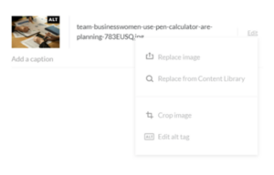
Alt text: Alt text is a description of what is happening in the image. It is useful for individuals with limited or no sight as the text description can be read by a screen reader. All images in Rise can be given an alt text label. You can also use 2 speech marks (“”) in the alt text description area to apply a “null tag”, indicating that it is decorative only.  To add alt tags in Rise go to content settings, click edit next to the image and a drop down list should allow you to edit the alt tag. Alternatively if you add a caption to an image it will populate the alt text area.  

Text on Image: If an image contains text ensure this it is thoroughly described in the alt text description or caption. Alternatively you can add a separate text block and then apply a null tag to the alt text area to mark the image as decorative to avoid duplication.  

Audio/ Video  

Closed Captions/Transcripts: It’s extremely important to include captions and/or transcripts for learners who are hard of hearing. If you are importing an audio or video file directly in to Rise, you won’t be able to add captions, so you will either need to ensure that they are part of the video file, or use a transcript. We would recommend that long videos are always transcribed anyway. We tend to use the accordion block with a single row for transcripts as it isn’t too imposing or disruptive for those who don’t want to view it.  

If you’re embedding a video from YouTube or Vimeo, you have the ability to add your own captions. There is plenty of help online if you want to do it yourself, but we also recommend utilising the services of a company like Rev who create your caption files and transcripts at a very cheap rate, and in super quick time too.  

Controls: Again it’s important for audio and video to have controls so learners can change the volume, pause, or skip to a certain point in the file. This isn’t an issue in Rise as these controls are all standard, and should also be available on embedded options.  

Visual Descriptors: Similar to alt text, you should add descriptors to videos where any visual action occurring in essential to a learners understanding of the content. We aren’t aware of any easy way to add spoken visual descriptors to your video, but again you can add these to your transcript until the technology catches up.  

Colour  

Contrast: Colour contrasting is used to ensure that there is a discernible difference between text and background colours to enable the text to be easily read. This is important for anyone, but particularly for those with sight impairments. You shouldn’t assume that the contrast is OK, just because it is clear to you. Depending on the WCAG level the recommended contrast amounts vary. This Contrast Checker site is a great tool to use when looking to use different colour texts or backgrounds. Just enter your RGB or Hex codes and adjust accordingly until all boxes are ticked.  

TPGi have also developed a free desktop Colour Contrast Analyser (for Windows and Mac) that allows you to quickly determine WCAG accessibility standards using a simple eyedrop tool.  

Things get a bit more complicated when you have text overlay on an image or gradient background, so be careful when using these. It is particularly notable in Rise where you can add an image to the title and statement blocks. You can of course adjust the image opacity/transparency, but use the analyser tool on the lightest or darkest part of the image (depending if you are using dark or light text) as the baseline.  

Use of Colour: Don’t rely on the use of colour alone to convey a message (i.e green for “correct” and red for incorrect”). You should always use words and/or icons instead of, or in addition to colour to ensure that everyone is able to differentiate where needed.  

Keyboard Controls 

Keyboard controls can be difficult to communicate, but the full list for Rise keyboard controls can be seen here, which you should make available to your users. 

The new updates to rise have improved one of the biggest barriers to accessibility – the hierarchy of items. This determines the order in which keyboard controls and screen readers work through the content. In Storyline, you can adjust this manually but it is automatic in Rise so when you are creating a course, try to use consistent ordering of things, like the type of headings 

Other things to consider  
 

Time constraints: Avoid restricting access to content where possible and make it pausible so every learner can learn at their own pace. You should also include an estimated course completion time so learners can plan ahead.  
 
Navigation: Navigation should be clear and user friendly. Ensure that any alt text for navigation clearly matches the action.  
 
Flashes: Avoid any content that flashes more than 3 times per second  
 
Quizzes: Add in a description of the amount of questions and the type users will encounter. Ensure all quiz questions have a descriptive answer as users may not be able to see what is right or wrong on screen.  
 
Language: One of the easiest ways to make content more accessible is to be more aware of the context around the content you are creating. If you add in a download tell the user a download is available below so users are constantly aware of what is coming next. Make sure to use consistent language for easier guidance and ensure it matches any supporting documents e.g keyboard navigation.  
 
 
Links: When adding a link out, whether to a document or website, make sure you add text on the button or before the download to inform users.  
 
Text size: Although there is no official minimum size guidance, it is generally recommended that you use a sans serif font with distinctions between letters at 16px or above. 

We hope you found this useful. For more information on general accessibility, the UK government Accessibility Blog has lots more information and helpful tips. We’ve picked a few out for you.  

If you have any questions on accessibility, feel free to get in touch! 

ADDRESS

1ST FLOOR, 40 Kent Road,

St Crispin Local Centre,

Northampton, NN5 4DR

WORK INQUIRIES

INFO@SPOKESEDUCATION.COM 

+44 (0) 3003 03 07 08

LEKSHMI ANIL

Lekshmi loves listening to music and spending time with her family and friends when away from work. She enjoys dancing and is a pretty good cook!


Kyle homer

I spend most of my spare time listening to music and usually plan my weekends around watching live music! I am also a huge Arsenal fan and try to go to games as often as possible, if not I watch them whilst hiding behind the sofa.

I have just finished my MA in Modern History and can often be found with a dull-looking book in hand! When I get the opportunity I enjoy travelling and experiencing new cultures and especially food!

DANIEL MENDONÇA

Daniel has a degree in Advertising and Publishing. He moved to the UK from Brazil to pursue new creative challenges.

Daniel is a DIY enthusiast. He is often painting, wallpapering, changing furniture or just turning his place upside down. He also loves cooking and you are likely to find him looking after the BBQ at a party. 

HAZEL SEPPINGS

Hazel has always been fascinated with creating things in their free time, and you’ll find them working on a painting or creating something from clay.

While waiting for those to dry, they’re either watching their latest TV obsession, exploring the local area, or going to gigs and exhibitions.

Hazel Profile

vicky stafford

Vicky is happiest when spending time with her family, especially when exploring the outside!

She is also an avid theatre-goer (especially musicals!), loves a family film night on the sofa, and cosying up with a good book.

Vicky Profile

MIA ABRAHAM

Mia enjoys attending gigs and festivals, and snowboarding in her spare time.

When she’s looking for something more chilled, you’ll often find her mooching around a good charity shop.

Mia_Profile

EMMA EYTON-JONES

Emma loves exploring the UK and Europe in her campervan and having adventures with her dog Skip.

When she is not away, she can be found playing tennis (badly) or watching a good film.

Emma_Profile

DANIELLE MARCH

Danielle loves spending time with her family and enjoys day trips to the beach, watching a new crime drama with a good cuppa and baking for her friends and family.

When time allows, Danielle also loves to explore a new country but believes there are too many great places to go back twice (unless it’s the Maldives!).

Danielle_Profile

Zoe Barnes

Zoe is a PGCE-qualified English teacher, with experience of teaching in secondary schools both in the UK and internationally. During her teaching career, she particularly enjoyed delivering CPD sessions on good teaching and learning practices, and mentoring trainee and newly-qualified teachers. She now applies these skills to learning design and developing our courses.

Zoe loves to travel and see the world, and has lived in The Netherlands, New Zealand, and Portugal. She enjoys weekly Parkrun 5ks, and the occasional 10k race. She continues to create and share teaching resources with the online English teaching community.

Zoe_Profile

Emily HARDY

Emily has always had a passion for animation and digital media. After getting her masters degree back in 2013, she’s spent seven years in the industry, collecting knowledge and honing her skills. 

Her time animating professionally has given her a wide range of knowledge in everything from 3D to stop motion!

When she’s not at work, she’ll be at home chilling out and watching a film with her partner, dog, and two cats. Weekends are reserved for pub trips and beer-making!

Emily_Profile

Hannah Webster

Hannah is responsible for social media and communications, and will likely be the first person you speak to if you get in touch with us.

Hannah has recently completed a degree in Business and Management at the University of Sussex. She manages our social media accounts and email inboxes, as well as helping out on development projects.

Outside of work, Hannah enjoys socialising with her friends and going out walking. You’ll find her happiest with a large cup of tea and a packet of biscuits.

PHIL HALSON

Insert text Insert text Insert text Insert text Insert text Insert text Insert text Insert text Insert text Insert text Insert text Insert text Insert text Insert text Insert text Insert text Insert text Insert text Insert text Insert text Insert text Insert text Insert text Insert text Insert text Insert text Insert text Insert text Insert text Insert text Insert text


AMBER MILLER

Amber is a talented graphic designer and an expert on accessibility. She can put her skills to anything creative, working with the Adobe suite to make courses, materials and collateral look attractive and professional.
 
Amber is involved with the local Autism Strategy and creating the local autism resource website. In her free time, Amber trains her rescue dog, Scout and she also enjoys learning Spanish and coding.
 

GARY FITZHUGH

With 20 years of creative experience, Gary brings a wealth of knowledge and skills in everything design, from print to video and 3D to web. As our motion graphics lead, he brings content to life through attractive and engaging videos and animations.

When he’s not busying himself at work, Gary enjoys long walks with his dog, running, snowboarding and watching an unhealthy amount of YouTube.
 

KAYLEIGH MESSINGER

Kayleigh is formerly a physiotherapist with a background in digital media. This means she is extremely versatile and can also use her Learning Design, Articulate and Adobe skills to work across all areas of the business.

Kayleigh is an English Kiwi, who loves travel and adventure. When she isn’t out and about with her friends and family, she can be found chilling at home with her partner and her cat, Pickles, where she enjoys creating art, reading and baking.

MATT GARVEY

Matt has an extensive background in the service industry enabling him to work across all areas of our business. He works primarily with the development team on Storyline projects, but he also leads our audio/visual work, managing our voiceover roster and producing our AV assets.
 
Matt is an avid reader, who loves queuing up the next thing to enrich his mind. He is also a gamer with his own YouTube channel, where he reviews retro-inspired video-games, as well as being a keen runner and keep-fit enthusiast.
 

CHARLOTTE SIDDALL

Charlotte brings a background in media production and content creation. She is another versatile member of our team, able to apply her skills and experience to an array of tasks, including storyboarding and course development.

Charlotte enjoys watching horror films (despite being terrified half the time), scenic walks around National Parks, yoga and reading whatever she can get her hands on.

CLAUDINO MONTEIRO

Claudino has 8 years of experience as a digital media designer and is an expert in Articulate Storyline. Heading up our development team, Claudino ensures all of our courses are interactive, accessible and functional. He is also a skilled designer and illustrator, so substance is always with style.
 
As a new dad, Claudino spends a lot of his spare time playing with his son. When not doing that, he enjoys cooking (he’s a major foodie) and playing video games.
 

RACHEL MURRAY

Rachel is a former teacher with a wide range of talents. She specialises in learning design and development in Articulate 360. She was our first employee so knows the business inside out and will be able to help with anything you need!

Rachel is at her happiest when spending time with family, reading her kindle, singing badly to loud music or drawing up pretty things on her iPad.

Phil Spokes

Phil is responsible for the smooth running of the business and ensuring the team and our partners are all kept happy.

Phil has 12 years of training and project management experience and specialises in digital learning design, development and delivery. As the company director, he is responsible for ensuring that our values are upheld, and the team have everything they need to provide an unbeatable service.

Phil enjoys travelling, road trips, dog walks in the woods and is a long-time season ticket holder at Northampton Town FC. He also enjoys volunteering with schools and is a STEM Ambassador and the Enterprise Advisor for Billing Brook School.

Linda Kalnina

Linda has nearly a decade of experience working in education and has postgraduate qualifications in creative industries. She leads the creative design team throughout the design process, from creation of concept to completion of course designs and animations.

Linda loves outdoor adventures and has led expeditions across Europe. She enjoys yoga and dog walks, or just keeping cosy with good coffee and good music.

Dr. Mark Spokes

Mark brings over a decade of experience in academic leadership within international higher education, specialising in digital teaching and learning. 

Mark is a qualified psychotherapist and expedition leader. He is often found on a mountain or in a forest.